


The Assignment:
"You are a packaging engineer for Nike. Times are tough and you have full design responsibility over their new line of shoes, the Filson.
The digital prototype of the Filson model shoe has been provided.
The marketing group leader has expressed that the Filson line of shoes are about 'customization, usability and the consumer'. They are the most organic and sustainable shoe on the market. In order to leverage this concept, the marketing team has found a certain package design to be inspirational.
Thus, you have been requested to create a very similar dieline from e-flute corrugated board. (Also, the Nike logo needs to be die-cut from the box.)
Furthermore, Nike recently fired all of their graphic designers - so its just you. Communicate the organic nature of these shoes.
Also, no one is present at Nike to create this sub-brand logo. Nike needs advice on a logo or symbol that makes the Filson stand out. But, we need a prototype STAT!
After you have organized your shoe box, graphics and logo, Nike needs to have global-corporate sign off on the project, so make it look your best!"
Here's the prompt for this major assignment from my packaging class:
My Prototype:
 |  |  |  |  |
|---|
Visual Foundations


Brainstorming... (hover or click to view)
 Guitar Stand Inspiration |  Guitar Stand |  Guitar Pick Bowl Inspiration |
|---|---|---|
 Guitar Pick Bowl |  Guitar Pick Inspiration |
Solidworks Parts...
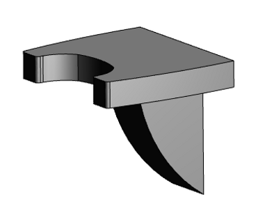


Guitar Stand
I'd always wanted one of these guitar stands because they are great for safely displaying guitars when they aren't being used and they save floor space while making any room more interesting.
I wanted to design a practical pick container that's both stylish as well as functional and the silhouette of a guitar seemed most appropriate.
Pick Bowl
Pick
Here I wanted the Kelter brand name to be on the pick but I wanted it to be more than a printed on logo so I engraved it into the pick to represent a higher quality product.
Package Dielines...
Guitar Stand
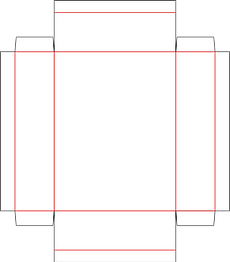
A simple package design that easily showcases the product and allows for ample graphics, I recreated this package based off another using Artios CAD software.

Pick Bowl

For this product, I focused more on the unboxing experience and decided to go with a 2-piece package so the bowl could easily slide out of it's surrounding container. The window was strategically placed to use the product as part of the package design.
Guitar Pick

To represent higher quality than most, I chose to package Kelter guitar picks individually with plenty of space around the pick to really showcase the product. The package is simple yet the customer can still see the effort put into packaging such as small item. My inspiration for this package was a folded gift card carrier.
Mood Board & Brand Guide...
Mood Board
For this part of the class, I gathered some inspirational images to create the mood for my brand and product line packaging. Each imaged chosen represents the Kelter brand in some way and flows together with the keywords listed at the top to show a visual representation of the brand. This layout is very similar to what you would see on Pinterest and is visually appealing.
The Kelter brand guide is simply a reflection of the mood board but goes into a little more detail on what the brand is composed of (brand logos, colors, fonts, and more imagery).
This guide is setting the stage for how the brand should be represented through all mediums but for this class it's just for the packaging.
Brand Guide
Package Graphics...

After setting the brand guidelines, I created graphics to match. I decided to use a single brand color for each product to show a difference between the products but when showcased next to one another, they clearly flow together without looking the exact same.

I chose the back of this package to put the majority of the information because if this product was placed on a shelf then I would want the consumer to see either the brand name or product first so that they would take interest in the product then pick it up to read more about it.
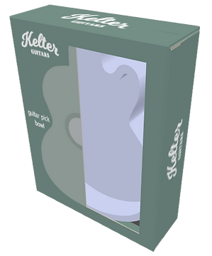

Here you can see what I was talking about earlier with the product being a part of the package design. I thought this would be a cool and unique way to use a window to show the product while also throwing in a little design.
I did the same sort of thing with information here that I did with the guitar stand. If this package was sitting on a shelf in a store, either the sides would be showing or the front of the package so I made sure that the consumer would see the initial important information first - the company and the product.


This type of package is not very common which is why I chose it. Small item packaging is normally neglected but I wanted to take advantage of this and showcase a small item to hint at the quality behind it. More effort put into packaging? It must be worth something then, right?
Final Printed Package - Guitar Stand (hover or click to view)
 Product in package (front) |  Product in package (back) |  3D printed part (front) |
|---|---|---|
 3D printed part (front/angle) |  3D printed part (back) |  3D printed part (back/angle) |
 3D printed part on wall |  3D printed part in-use |  3D printed part in-use |
Palletization...
Guitar Stand

Guitar Pick

Guitar Pick Bowl

Using Cape Pack, I was able to compute optimal organization for the greatest number of each of my products per pallet which would be important to know if I were shipping Kelter products across the U.S. or even across the world. This program solves most packaging problems, is simple to use, and answers questions such as:
-
"Which load is more economical?"
-
"How do I create realistic packaging components for my specifications?"
-
"How can I communicate the results to my colleagues/customers?"
-
"What is the best way to load this product onto a pallet?"
-
"How many boxes can I fit on a pallet?"
-
"How will the pallet load fit in a truck?"